
Why Does Mobile-Friendly Content Matter?
80% of the world's population uses smartphones. The average user checks their phone 221 times a day.
When you design for mobile, you meet people where they are.
When you don't design for mobile, people notice. The text is too small. It's difficult to navigate. The visual design is off. People leave.

What is Mobile-Friendly Content?
Mobile-friendly content is specifically designed for mobile devices. It's not simply a smaller version of desktop content.
Content is legible and accessible on smaller screens.
Navigation is simple and consistent.
Content is clear and easy to understand.
Mobile content works well when tested by real users.
 Put It Into Practice
Let's look at some case examples of mobile learning experiences. These lessons can apply to other examples, such as mobile websites and app development.


1. Design for Accessibility
Design Accessible, Mobile-Friendly Content
Web Content Accessibility Guidelines (WCAG) is the key resource for accessibility success criteria. You can use it for desktop or mobile design. Follow these five WCAG tips for mobile design:
Does your content work well for both landscape and portrait orientations?
Does your content adapt to smaller screens without losing information or needing to scroll?
Are your touch interactions simple (basic taps and swipes) and large enough (at least 24 x 24 CSS pixels)?
Is your text legible with sufficient color contrast? Recommended text size is 16 point font. Try using a color contrast checker.
Can you resize text up to 200% without losing resolution?
Put It Into Practice
Consider a current mobile learning project. Does it meet all five of the above accessibility criteria? If not, what changes can you make to improve accessibility?
Here are examples for each of the actions:
Orientation: A learner watching a video can rotate their phone without losing access to controls.
Layout: A checklist fits on one screen without horizontal scrolling.
Interactions: Buttons are easy to tap without zooming in or accidentally hitting the wrong one.
Color contrast: Light grey text on a white background is changed to dark grey text on a white background.
Zoom: A learner with low vision can zoom in up to 200% on instructions.
 Learn More
This is a quick start accessibility guide. For further guidance, see Guidance on Applying WCAG to Mobile Applications. For the full success criteria, see WCAG 2.2.


Quiz
Your mobile content uses grey serif text on a white background. Learners say it’s hard to read. What should you do? Select all answers that apply:
2. Simplify Navigation
Desktop navigation bars can include multiple categories and sub-items. Unlike desktops, mobile devices do not have this luxury of space. You need to simplify your navigation to cover just the essentials. If your navigation isn't intuitive and user-friendly, your readers may leave.
Use intuitive groupings for your navigation categories.
Choose whether to use side, top, and/or bottom menus (e.g., top and bottom menus shown below).
Place the most important information as main categories. The next most important can be placed as first items in the drop-down.
Use fewer levels (sub-items) in your navigation bar.
Use clear headings and labels.
Use simple taps and swipes. Avoid complex gestures.
Review the navigation for the mobile course shown below:
 Image created with Microsoft Copilot
Put It Into Practice
Consider a mobile learning experience, such as a full online course or a microlesson. On your mobile, review the navigation menus of this learning experience:
Are they simple and intuitive?
Did you use a common layout, or are you breaking conventions?
Can you access information with simple gestures?
Quiz
Your mobile course has a top menu with 10 items. The menu text is small. Learners feel overwhelmed. What’s the best solution?
3. Reduce Cognitive Load
Cognitive load means that human beings have a limited amount of processing power or working memory. We want to create mobile content that is clear and easy to understand. This lowers the cognitive load and improves learning.
Write lean: Say what matters and that's it.
Reduce clutter: Remove decorative images, such as stock photos that don't add meaning. Stick to one or two simple sans serif fonts.
Use intuitive design: Use known mobile layouts. Don't break conventions (e.g., account information is in the top right).
Apply structure: Logically organize content with a clear path to completion.
 Watch: What is Cognitive Load?
Watch this video for three tips to reduce cognitive load.
Put It Into Practice
Review your mobile learning content:
Can you reduce the word count by 10% or 20%?
Check out this wordiness list for words you can exchange (e.g., "due to the fact that" = "because" or "end result" = "result").
Are you using plain language that someone in grade 8 could understand?
Have you removed any "flashy" graphics or font styles that don't add to the key message?
Quiz
You’re reviewing a mobile module with multiple fonts, animations, and decorative images. What should you remove to reduce cognitive load? Select all answers that apply:
4. Test Your Content
Use mobile preview features to test your content as you go:
Make sure it works in portrait and landscape.
Ensure the navigation is clear.
While self-testing is helpful, you're already very familiar with your design. Remember, you are not your user! This can lead you to miss major blocks for your learners. Consider asking colleagues to navigate your online learning experience from their mobile device and provide feedback.
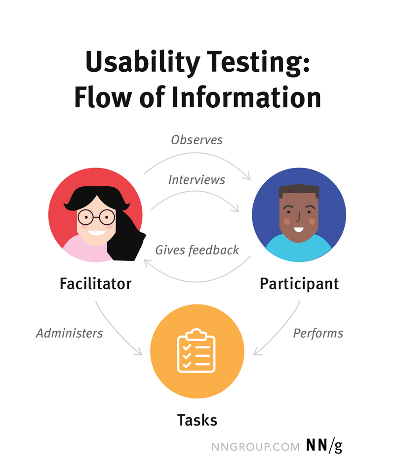
Usability Testing
Better yet, try usability testing. It's effective and evidence-based. You can do usability testing in a few days with five learners.
Recruit five representative learners.
Determine realistic tasks for mobile learning.
Ask them to think aloud as they complete tasks.
Record results. Include qualitative feedback (comments), completion rates, and time on task.
Based on results, make changes based on what you learned.
 Nielsen Norman Group. Moran, K. (2019, December 1). Usability (User) Testing 101. Retrieved October 23, 2025.
Put It Into Practice
Realistic actions: Create 5-7 realistic actions a learner can do in your mobile learning experience. For example, access Module 1 Lesson Three. Upload a document to Assignment 1. Check your grades. Test your content across multiple mobile devices and operating systems to ensure consistency.
Recruit learners: Identify who your representative learners are. How can you recruit them? You may need a financial incentive like a gift card to compensate them for their time. Recruit five learners.
Run the usability test: Conduct the usability tests one learner at a time. Note your findings and areas for improvement. Remember, iteration is key to design!
 Image created with Microsoft Copilot
Quiz
You’re preparing to test your mobile course. What’s the most effective way to gather feedback? Select all answers that apply:
Take Action
Apply these tips to design mobile-friendly content. They're based on user experience and accessibility best practices. These tips make mobile learning easier for everyone.
Your feedback matters to us.
This Byte helped me better understand the topic.